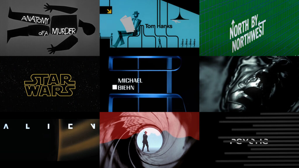
Movie title sequences have always played a crucial role in cinema, serving as the first point of contact between the film and its audience. These opening sequences are much more than just a list of credits; they set the tone, atmosphere, and expectations for the story to come.

A well-crafted title sequence can immediately immerse viewers into the world of the film, offering a visual and auditory experience that encapsulates the essence of the movie. Over the years, certain title sequences have transcended their functional purpose, becoming iconic pieces of art that stand the test of time.
From the early days of cinema to the modern era, these sequences have evolved in style and complexity, often pushing the boundaries of design and storytelling. Some are remembered for their groundbreaking techniques, while others remain in the cultural consciousness because of their striking visuals or unforgettable music. Whether through minimalism or intricate animation, these sequences reflect the creative vision of filmmakers and designers who understand the power of first impressions.
The following list is a countdown of 25 of the greatest movie title sequences in cinematic history. Each entry on this list has been selected not only for its artistic merit but also for the way it perfectly encapsulates the mood and themes of the film it introduces. From the whimsical to the terrifying, the following sequences have all made a lasting impact on audiences and the world of cinema.
25. “Napoleon Dynamite” (2004)
- Designer: Jared Hess
- What Makes It Special: The quirky, handmade objects used to present the credits reflect the film’s offbeat humor and indie spirit. The sequence sets the tone for the film’s oddball narrative and small-town charm, making it a perfect introduction to the world of Napoleon Dynamite.
24. “West Side Story” (1961)
- Designer: Saul Bass
- What Makes It Special The abstract, modernist imagery captures the energy and emotion of the film. The simple, yet powerful visuals paired with Leonard Bernstein’s score establish the vibrant, yet tension-filled atmosphere that defines the story of rival gangs in New York City.
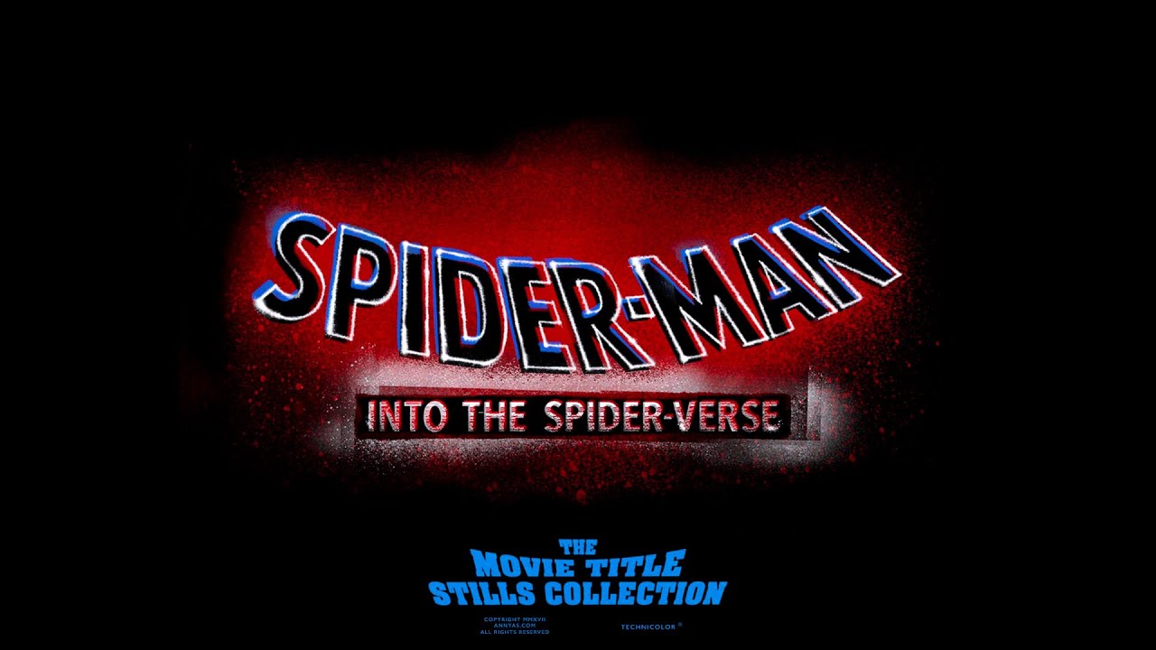
23. “Spider-Man: Into the Spider-Verse” (2018)
- Designer: Patrick O’Keefe and his team
- What Makes It Special: The vibrant, comic book-inspired sequence reflects the film’s unique visual style, blending animation techniques that mirror the comic book aesthetic. It’s a groundbreaking sequence that celebrates the medium while pulling viewers directly into the Spider-Verse’s dynamic, multi-dimensional world.
22. “The Terminator” (1984)
- Designer: Richard Greenberg
- What Makes It Special: The metallic, industrial text paired with Brad Fiedel’s pulsating score introduces the relentless, dystopian world of the film. The sequence perfectly sets up the film’s themes of technology, fate, and survival, immediately immersing viewers in its bleak and high-stakes narrative.
21. “Fight Club” (1999)
- Designer: Kevin Tod Haug
- What Makes It Special: The journey through the protagonist’s brain, culminating in a shot of Edward Norton’s face, symbolizes the film’s psychological themes. The sequence is both visually stunning and thematically relevant, hinting at the unraveling of the protagonist’s mental state and the chaos to come.
20. “Watchmen” (2009)
- Designer: Kyle Cooper
- What Makes It Special: The use of Bob Dylan’s “The Times They Are A-Changin’” paired with a montage of alternate history sets the stage for the film’s complex narrative. This sequence not only introduces viewers to the world of Watchmen but also provides crucial context, making it an essential part of the storytelling.
19. “Superman” (1978)
- Designer: Richard Greenberg
- What Makes It Special: The bold, sweeping text that flies across the screen mirrors Superman’s heroic flight and the film’s epic scope. It was a groundbreaking sequence for its time, setting a new standard for superhero films and establishing a sense of grandeur that would define the genre.
18. “Anatomy of a Murder” (1959)
- Designer: Saul Bass
- What Makes It Special: The abstract, disjointed human forms create a sense of mystery and intrigue, perfectly encapsulating the film’s courtroom drama. The sequence is iconic for its innovative use of graphics to convey complex themes of justice and morality.
17. “The Good, the Bad and the Ugly” (1966)
- Designer: Iginio Lardani
- What Makes It Special: The bold use of animation and split screens, paired with Ennio Morricone’s iconic score, creates a sequence that is both stylish and evocative of the film’s epic narrative. It immediately sets the stage for the spaghetti western’s larger-than-life characters and story.
16. “The Shining” (1980)
- Designer: Saul Bass (uncredited)
- What Makes It Special: The eerie, unbroken helicopter shot with the simple, chilling typography creates an atmosphere of impending dread. The sequence is haunting in its simplicity, establishing the isolated and terrifying world of the Overlook Hotel long before the horror unfolds.
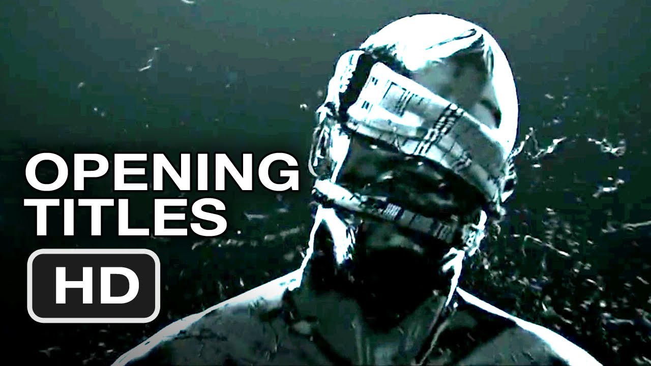
15. “The Girl with the Dragon Tattoo” (2011)
- Designer: Blur Studio
- What Makes It Special: The dark, oil-slick visuals and aggressive music set a foreboding mood that mirrors the film’s themes of violence and corruption. The sequence is visually striking and disturbing, drawing viewers into the gritty world of Lisbeth Salander.
14. “Alien” (1979)
- Designer: Richard Greenberg
- What Makes It Special: The slow reveal of the title, building tension and mystery before the film begins, perfectly mirrors the film’s pacing and atmosphere. This minimalist sequence creates an eerie sense of anticipation, setting up the terrifying and claustrophobic experience to come.
13. “Drive” (2011)
- Designer: Eric Steelberg and Filmograph
- What Makes It Special: The neon-pink typography and synth-driven soundtrack set the tone for a stylish, modern noir. The sequence immediately establishes the film’s cool, retro aesthetic, and the lonely, detached world of its protagonist.
12. “North by Northwest” (1959)
- Designer: Saul Bass
- What Makes It Special: The dynamic use of geometric shapes and Alfred Hitchcock’s famous cameo introduce viewers to the film’s world of espionage and intrigue. This sequence is a masterclass in using abstract visuals to convey a sense of excitement and suspense.
11. “Dr. No” (1962)
- Designer: Maurice Binder
- What Makes It Special: The introduction of the iconic gun barrel sequence and colorful, rhythmic visuals that set the tone for the Bond series. It was groundbreaking at the time and has become one of the most recognizable and enduring elements of the James Bond franchise.
10. “A Clockwork Orange” (1971)
- Designer: Pablo Ferro
- What Makes It Special: The stark, minimalist typography and use of Beethoven’s music introduce the film’s disturbing world. The sequence’s bold simplicity and unsettling imagery perfectly encapsulate the film’s exploration of violence and free will.
9. “Catch Me If You Can” (2002)
- Designer: Kuntzel + Deygas
- What Makes It Special: The retro, animated sequence cleverly illustrates the film’s cat-and-mouse chase, setting a playful yet suspenseful tone. The stylish animation and jazz score encapsulate the film’s 1960s aesthetic and lighthearted approach to crime.
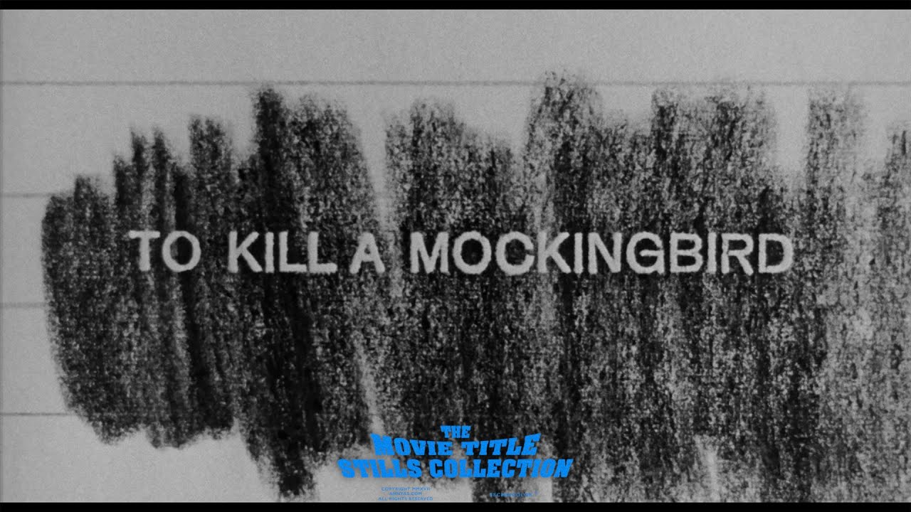
8. “To Kill a Mockingbird” (1962)
- Designer: Stephen Frankfurt
- What Makes It Special: The intimate, childlike perspective reflects the innocence and gravity of the film. This sequence subtly introduces the themes of childhood, morality, and social justice that are central to the story, making it an emotionally resonant start to the film.
7. “Goldfinger” (1964)
- Designer: Robert Brownjohn
- What Makes It Special: The gold-covered women and Bond imagery define the aesthetic of James Bond title sequences. This sequence set the standard for the franchise’s iconic opening visuals, combining elegance, allure, and danger in a way that has become synonymous with 007.
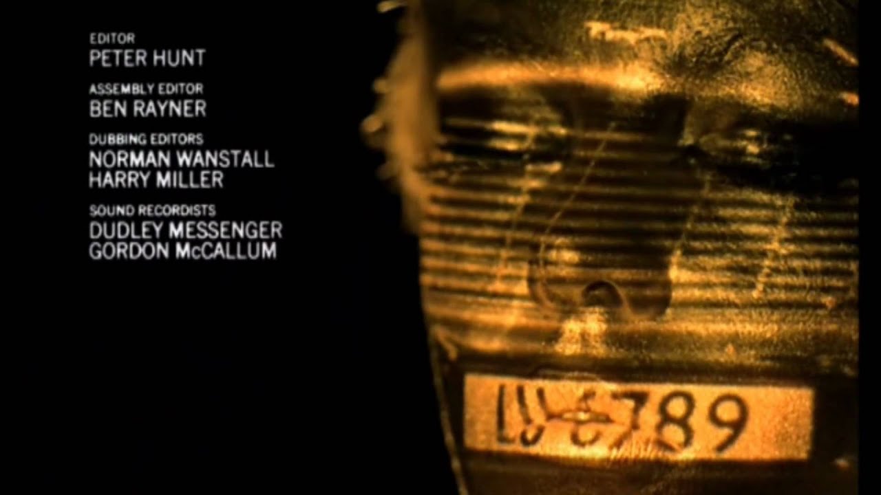
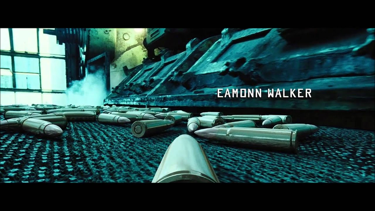
6. “Lord of War” (2005)
- Designer: Jaroslav Gudev
- What Makes It Special: The chilling depiction of the life of a bullet, from manufacture to its deadly end, illustrates the global arms trade’s dark realities. The sequence is powerful and provocative, perfectly setting up the film’s critique of war and the arms industry.
5. “Vertigo” (1958)
- Designer: Saul Bass
- What Makes It Special: The swirling, hypnotic graphics evoke the film’s themes of obsession and fear. This sequence is not only visually mesmerizing but also serves as a perfect metaphor for the film’s psychological depth, making it a timeless classic in the world of cinema.
4. “The Pink Panther” (1963)
- Designer: Friz Freleng
- What Makes It Special: The introduction of the animated Pink Panther character, which became an icon in its own right. The playful and stylish sequence set the tone for the comedy that followed and spawned an entire franchise, making it one of the most beloved title sequences of all time.
3. “Psycho” (1960)
- Designer: Saul Bass
- What Makes It Special: The use of sharp, intersecting lines and Bernard Herrmann’s intense score create a sense of unease that perfectly mirrors the film’s suspenseful and terrifying narrative. The sequence is a masterclass in tension-building, setting the stage for one of the most iconic thrillers in history.
2. “Se7en” (1995)
- Designer: Kyle Cooper
- What Makes It Special: The gritty, unsettling atmosphere, created through quick cuts and disturbing imagery, perfectly reflects the film’s dark themes. The sequence revolutionized modern title design, influencing countless films and television shows with its innovative style and tone-setting impact.
1. “Star Wars” (1977)
- Designer: Dan Perri
- What Makes It Special: The iconic opening crawl paired with John Williams’ powerful score immediately immerses the audience in a galaxy far, far away. This sequence is one of the most recognizable in cinema history, setting the tone for the epic space opera that would become a cultural phenomenon. Its simplicity, combined with its unforgettable music and typography, has made it the gold standard for title sequences in blockbuster filmmaking.
These opening title sequences have each left an indelible mark on the art of cinema, not just for their design but for their ability to encapsulate the essence of the films they introduce. From the grandiose to the minimalist, each entry on this list demonstrates the power of a well-crafted title sequence to draw viewers into the story and leave a lasting impression.


